Components
Some specific components to take note of.
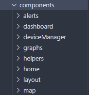
All individual components live in this folder, and are categorized according to either their parent page or any other common function (e.g. layout). These are broken down into further sub-directories as needed, for example, in the dashboard folder.
There are many components which are fairly self-explanatory, so here, we will only expand on some specific ones of note within documentations.
Table of contents
BaseLayout
This component can be found in /src/components/layout/BaseLayout.tsx
BaseLayout is a wrapper component which all the pages use. The purpose of this component is to act as a way to integrate react-hot-toast with every page through the <Toaster> component, as well as allow the sidebar to be hidden or visible as needed.
It may be of importance to explain a common pattern we use in our client, similar to a decorator (that is, we use a series of wrappers based on this design pattern).
Wrappers
To create “decorators” or wrapper components, we use this prop:
type wrapperProps = {
    children?: React.ReactNode;
};
The component will look something like this:
const WrapperComponent: React.FC<wrapperProps> = ({ children, ... }) => {
    return (
        <>
            ...
				{children}
        </>
    );
};
This allows us to have some control over whether or not we render specific children; for example in the <BaseLayout> component, we render the sidebar based on the isNavbarVisible prop.
BaseCard and BaseCardLoading
This wrapper component should be used for all cards, and draws a border around its children. For loading states, <BaseCardLoading> is a spinner that was made for these cards specifically. Render the <BaseCardLoading> component when the card is loading.
Graphs
All the graphs in this project are made through third party libraries. <AreaGraph> and <LineGraph> are created with the Recharts library, while <CircleGraph> was made from Chakra UI.
💡 Recharts’ <ResponsiveContainer> component has a bug where it won’t render if the width is set to 100%, hence width is set to 99% on each of the charts where it’s used. |
BaseTable
The <BaseTable> component was created from the tanstack/react-table library, which allows alphabetical and numerical sorting.
💡 DO NOT MODIFY the <BaseTable> component. To make a new table for use, you must create columns that are then used by the <BaseTable>. See Logs.tsx for an example. |
Follow the general structure of the <Logs> component to create columns.
- To start, create a type where each field represents a column in the table.
type logDataType = {
    id: number;
    time: string;
    dissolvedOxygen: number;
    electricalConductivity: number;
    pH: number;
    turbidity: number;
    totalDissolvedSolids: number;
    temperature: number;
};
- Create a hook using this type.
const columnHelper = createColumnHelper<logDataType>();
- Next, for each column, create a new cell in an array. The first argument in
.accessorshould correspond to the target field (e.g. the column name).
columnHelper.accessor('id', {
            cell: ({ getValue }) => {
					// This function gets the value from the data being rendered
                const val = getValue<string>();
					// This is what gets rendered for each cell; additional components can
				    // be embedded.
                return (<Text textAlign='center' fontSize={isLargeScreen ? 'md' : 'sm'}>{val}</Text>);
            },
				// The name of the column in the table's header row
            header: 'ID',
				// If the field is numeric or not - this is used when sorting
            meta: {
                isNumeric: true
            }
        })
💡 To disable sorting on a field, add the field disableSortBy: true as a field in the accessor object. This field must be added to avoid potential bugs with components living in the table (like buttons) which have no sortable value. |
- Simply import
<BaseTable>and add the columns and data as props.
// The Box component allows the table to horizontally scroll
<Box overflow='auto'>
	<BaseTable columns={columns} data={mockLogData} />
</Box>
Map
The map is built using leaflet.js and react-leaflet. React-leaflet acts as a wrapper for the leaflet library functions. You cannot have react-leaflet without leaflet so both are required.
Here is an example of how the react-leaflet wrapper component works:
<MapContainer
      id={mapId}
      doubleClickZoom={false}
      zoom={zoomVal}
      zoomSnap={zoomSet}
      center={center}
      // ref={setMap}
      zoomControl={false}
      bounceAtZoomLimits={true}
    >

		<TileLayer url={tilePath} />

</MapContainer>
Rendering the Map
The leaflet library requires some extra steps for rendering the map visually. Here are some important considerations when using the leaflet library:
- Base styles:
- The base styles of the map must be implemented, there are typically two approaches:
- Root DOM method ☹️: Find a CDN link from the website and attach it at the root DOM (index.html)
- Better method 🙂: import the styles you need into a stylesheet from the leaflet npm or yarn package to only be used by map component
@import '~leaflet/dist/leaflet.css'; - The base styles of the map must be implemented, there are typically two approaches:
This is cleaner and does not lead to potential stylesheet issues.
- Fixed height:
-
A limitation of the library is that the container that holds the map must be set with a fixed pixel height; this makes implementing a responsive map a challenge. The width can be set with responsive values.
- The main reason for why the map needs a fixed height is because if the map is constantly resized the tiles that are provided to the map might not fit on the new page which leads to unexpected behaviors.
- Therefore the intent behind a fixed map is to ensure that the map and map tiles are rendered correctly.
-
Here is the stylesheet implementation:
  /* Important for react-leaflet map
  			to load visually and connect css loaders to node modules.
      Also replaces the need to have the CDN link in index.html
  */
  @import '~leaflet/dist/leaflet.css';

  #mapId {
    /* setting the height to % or rem
  					will not render the map at all */
      height: 400px;
      width: 80%;
      position: relative;
      border-radius: 0.5rem !important;
    }
-